- Home •
- Marketing Milestones at HP •
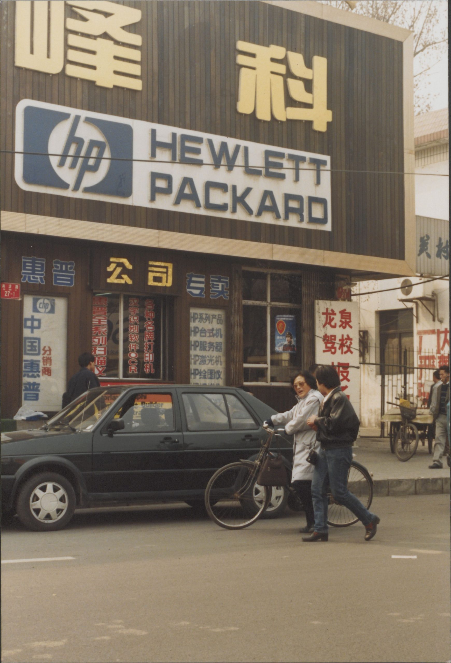
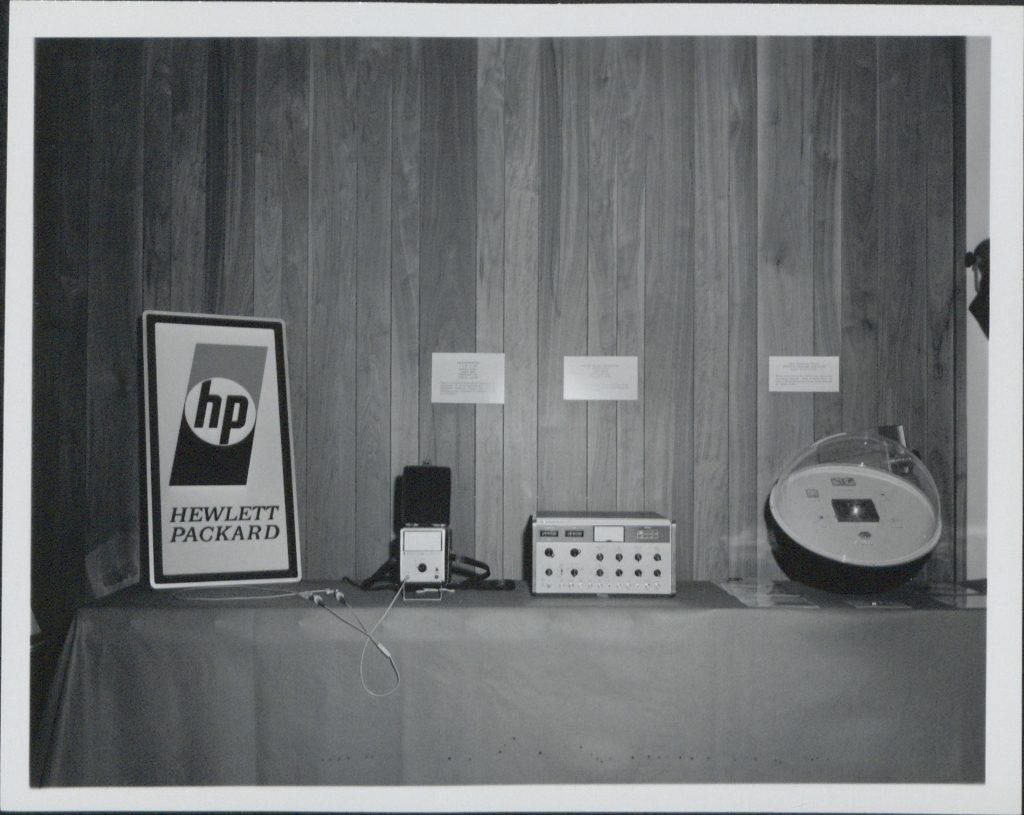
- A New Look: 1960s HP Logo Redesign
A New Look: 1960s HP Logo Redesign
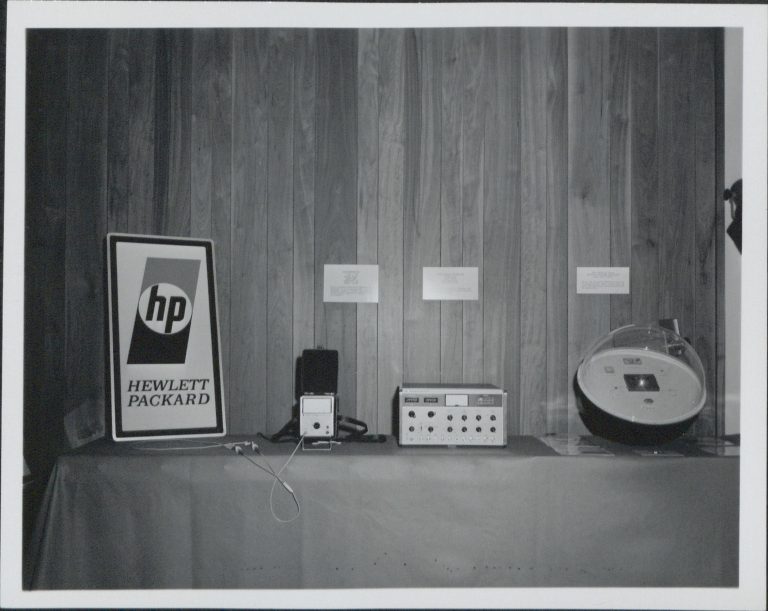
Date: ca. 1967
Shortly after introducing its first computer, Hewlett-Packard redesigned its logo for the first time in more than 20 years. The iconic lowercase initials within a circle remained, but the legs of the “h” and “p” no longer broke through, and additional elements were added, such as the shading above and below the circle and fully spelling the names “Hewlett” and “Packard.”
( C ) HPCA